These 7 basic Quality tools were suggested by Kaoru Ishikawa, a professor of engineering at Tokyo University in the 1960s and 1970s and the inventor of “quality circles.”
Ishikawa said that by mastering these tools you will be able solve at least 90% of Quality Problems in processes.
Ishikawa translated the teachings of W. Edwards Deming and Joseph Juran and integrated them into Japanese manufacturing culture.
Download .PDF booklet about the 7-Quality Tools here: 7-Quality tools 2-slides-per-page
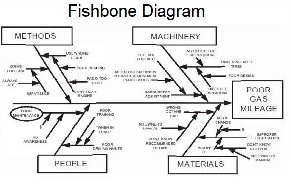
Identifies many possible causes for an effect or problem and sorts ideas into useful categories.
Common uses of the Ishikawa diagram are defect prevention to identify potential input factors causing an overall negative effect on an output. Each cause or reason for imperfection is a source of variation.
Causes are usually grouped into major categories to identify and classify these
sources of variation.
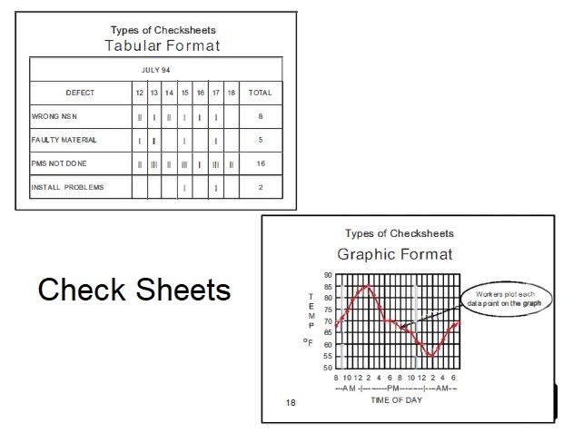
A structured, prepared form for collecting and analyzing data; a generic tool that can be adapted for a wide variety of purposes.
The data it captures can be quantitative or qualitative. When the information is quantitative, the check sheet is sometimes called a tally sheet.
Check sheets typically employ a heading that answers the Five Ws:
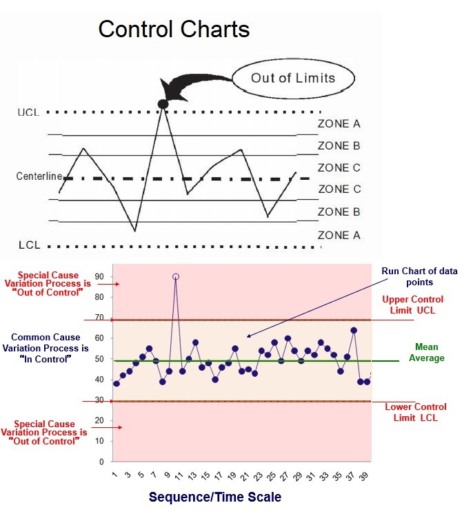
Graph used to study how a process changes over time. Comparing current data to historical control limits leads to conclusions about whether the process variation is consistent (in control) or is unpredictable (out of control, affected by special causes of variation).
Control charts, also known as Shewhart charts (after Walter A. Shewhart) or process-behavior charts, are a statistical process control tool used to determine if a manufacturing or business process is in a state of control. It is more appropriate to say that the control charts are the graphical device for Statistical Process Control (SPC).
A control chart consists of:
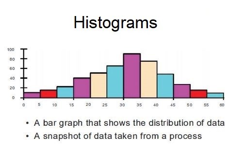
Histogram: The most commonly used graph for showing frequency distributions, or how often each different value in a set of data occurs.
A histogram is an approximate representation of the distribution of numerical data. It was first introduced by Karl Pearson in 1895.
To construct a histogram, the first step is to “bin” (or “bucket“) the range of values—that is, divide the entire range of values into a series of intervals—and then count how many values fall into each interval. The bins are usually specified as consecutive, non-overlapping intervals of a variable. The bins (intervals) must be adjacent and are often (but not required to be) of equal size.
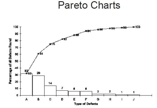
Pareto chart: A bar graph that shows which factors are more significant. This was first suggested as a tool by Dr. Joseph Juan and is used to demonstrate the 80/20 rule.
Individual values are represented in descending order by bars, and the cumulative total is represented by the line. The chart is named for the Pareto principle, which, in turn, derives its name from Vilfredo Pareto, a noted Italian economist.
The left vertical axis is the frequency of occurrence, but it can alternatively represent cost or another important unit of measure. The right vertical axis is the cumulative percentage of the total number of occurrences, total cost, or total of the particular unit of measure.
Note: The Pareto principle states that for many outcomes, roughly 80% of consequences come from 20% of causes (the “vital few”).
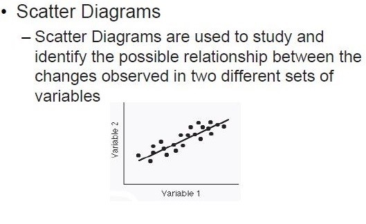
Scatter diagram: (also called a scatter plot scatterplot, scatter graph, scatter chart) graphs pairs of numerical data, one variable on each axis, to look for a relationship.. The data are displayed as a collection of points, each having the value of one variable determining the position on the horizontal axis and the value of the other variable determining the position on the vertical axis.
A scatter diagram can suggest various kinds of correlations between variables.
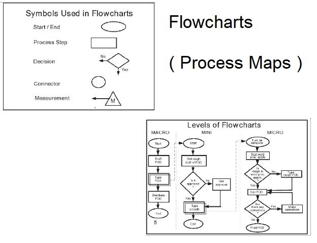
A Flowchart is a tool that graphically shows the actions and decisions of a process in a clear, step-by-step map of the process.
Flowcharts use rectangles, ovals, diamonds and potentially other shapes to define the type of step, along with connecting arrows to define flow and sequence.
Note : Some lists replace flow charts with Stratification as one of the 7 Tools .
” Draw a flowchart for whatever you do. Until you do, you do not know what you are doing, you just have a job.”
— Dr. W. Edwards Deming.


Address: Nine Hills Road, Cambridge CB2 1GE, England, United Kingdom.